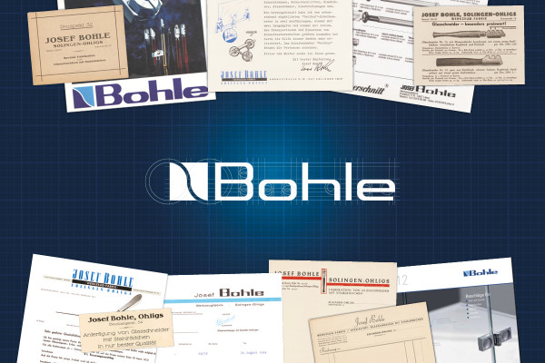
The Bohle logo has existed in its familiar form for approx. 40 years – now it has been given a new look. In recent years, the company has increasingly turned into a developer and manufacturer of high-quality product applications for interior and exterior fit-out with glass. The company has especially strengthened its competence in the areas of sliding doors and shower door hinges. This development towards new fields of business is also reflected in a new, modern company logo.
The redesigned Bohle logo is more of an evolution than a revolution compared with the previous trademark. The new lettering is simplified and more precise, giving it a clear and timeless appearance. The previous design can still be clearly recognised. It thus continues to convey the original values of quality and stability represented by its predecessor. The new logo is monochrome dark blue, making it appear like a single entity. The light blue colour that formed part of the design mark before can still be spotted as a design feature in the Corporate Design of the company. The written from will remain written in the normal way for the Bohle family name.
Sustainability is firmly anchored in the company strategy – and when it comes to making the change towards the new logo, the company puts great emphasis on not disposing of any materials unnecessarily only because they still carry the old logo. New packaging and catalogues will only be produced when ordered, which means that the old version will be gradually replaced step by step. The transformation in all our online channels, however, such as our Shop, newsletters or social media accounts will take place uniformly in all parts of the world.


