The Bohle logo has a new look
The Bohle logo has existed in its familiar form for approx. 40 years – now it has been given a new look. In recent years, the company has increasingly turned into a developer and manufacturer of high-quality product applications for interior and exterior fit-out with glass.
The company has especially strengthened its proficiency in the areas of sliding doors, all-glass balustrades, and shower door hinges. This development towards new business areas is also reflected in a new, modern company logo. Let´s take a look at the history of our logo together.
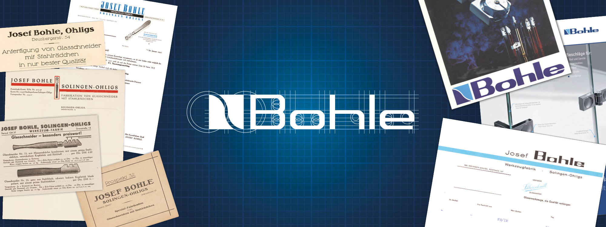
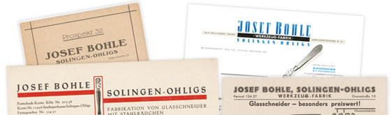
1923 - 1950s
From the founding of the company in 1923 up to the 1950s, there was no thought of a logo. The craft business was named “Josef Bohle” after its founder, a company name that has since appeared in many different ways.
The design of the lettering always reflected the style and technical possibilities of the time.
1960s
In 1964, the lettering became a designed logo for the first time. Its shape was taken from a glass cut. The Bohle family name comes to the fore emphasizing the long tradition of the family business.
The logo defines graphic elements, such as the rectangular lettering and the light blue stripes, which will be taken up again in the following logos.
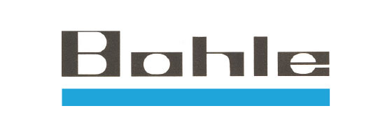
1980s
A contemporary further development of the previous logo takes place in the 80s.
The new version conveys stability and self-confidence and is further complemented by the “Silberschnitt” design mark. It represents a glass pane cut manually from top left to bottom right. This element originated from the "B" of the old logo from 1964. The colours have been adapted again and again over the decades.
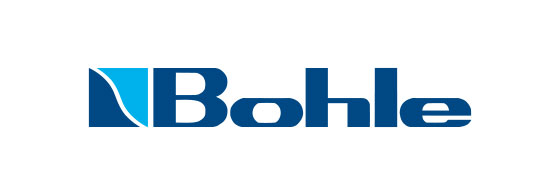
Today
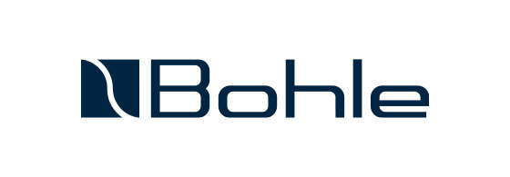
In 2021, it´s time for a change after 40 years! The new logo is monochrome dark blue, making it appear like a single entity. The lettering is simplified and more precise, giving it a clear and timeless appearance. The light blue colour that formed part of the design mark before can still be spotted as a design feature in the Corporate Design of the company.
The previous design can still be clearly recognised. It thus continues to convey the original values of quality and stability represented by its predecessor.
Sustainability is firmly anchored in the company strategy – and when it comes to making the change towards the new logo, the company puts great emphasis on not disposing of any materials unnecessarily just because they still carry the old logo. New packaging and catalogues will only be produced when ordered, which means that the old version will be gradually replaced. The transformation in all our online channels will take place uniformly in all parts of the world.
Learn more about the history of Bohle